Quest
Bank of america cmu capstone | 2014
Bank of America asked us to help increase their online engagement and sales by moving sales from their physical branches to their online website.
Over the course of 7 months, we researched and designed a solution to help them increase their online engagement and sales.
The Problem Space
After Bank of America approached us, our initial research led us to the following problem statement:
In what ways can we create an engaging and frictionless purchasing experience for customers, ensuring they take advantage of all of the services available to them, and in turn, drive sales growth in our digital channels?
Project Background
Over the course of 7 months, we went from a problem statement to a fully functional prototype by executive rigorous discovery, user research, and iterative prototyping.
Our team of 5 was comprised of a:
Team Lead - myself
Design Lead - Gaby Moreno Cesar
Research Lead - Shira Bauman
Tech Lead - Matthew Hsieh
UX Lead - Shuangshuang Li
Research Plan
Before ever thinking of a solution, we did 3 months of thorough research.
One of the more shocking things we discovered in our research was the disparate time it takes to open a checking account in a branch vs. online.
Discovers like this helped us piece together why customers aren’t flocking to the website for certain services.
After gathering our data, we put our notes on individual post-it notes and created data buckets in the form of an affinity diagram. This affinity diagram allowed us to naturally group related ideas. After grouping ideas, we created higher level data buckets that encompassed the overall messages and themes of the various groupings. Our completed affinity diagram helped reveal our main findings and insights
After our 3 months of research was complete. We put the notes on individual sticky notes and began categorizing them to help create categories of feedback. This affinity diagram revealed overall themes that eventually led us to four main insights.
The four main themes from our research are listed below.
Concept & Persona Generation
With our insights to guide us, we moved into concept generation. We tested 17 ideas with a total of 26 participants over 2 rounds of “speed dating” ideas. This allowed us to come up with a variety of possible ideas spanning a broad range of solutions and quickly learn which ones excited potential customers the most.
We tested these concepts guerrilla research by talking to potential customers on the street.
After narrowing down our top concepts, we then had an idea of what type of customers we were were targeting and designing for. These three personas represent the target users that needed the biggest push to move from branches to the online website and were most likely to do so.
Prototyping & Usability Testing
Please watch the following videos to see our different design iterations in action along with the user feedback we received.
Final Product
Our solution to Bank of America’s original challenge is Quest. Quest is an online interactive search that allows customers to receive personalized information and easily speak with banking specialists.
Quest revolves around the following features:
Collects customers’ personal details to create a personalized experience
Provides guidance and validation by suggesting information and giving customers direct access to banking specialists
Assists customers in finding information by allowing them to dynamically interact with search results and specialists
Allows tasks and sales to be completed online without having to turn to other channels such as call and banking centers
Patents
“If our ideas are implemented, we will revolutionize the banking industry and change the face of banking.”
And that we did! The five of us walked away not only with a Masters of Human-Computer Interaction, but also three patents!
CONTEXTUAL SEARCH TOOL
Search suggestions are provided to customers to help them explore the website and simultaneously learn. Their search results are updated and tailored to them based on the personal information they provide in their profile.
CONTEXTUAL SEARCH INPUT FROM ADVISORS
The in-branch experience is brought online by allowing customers to speak with financial counselors on the website. Customers can upload necessary documents and financial counselors can access and review them during video chats with customers.
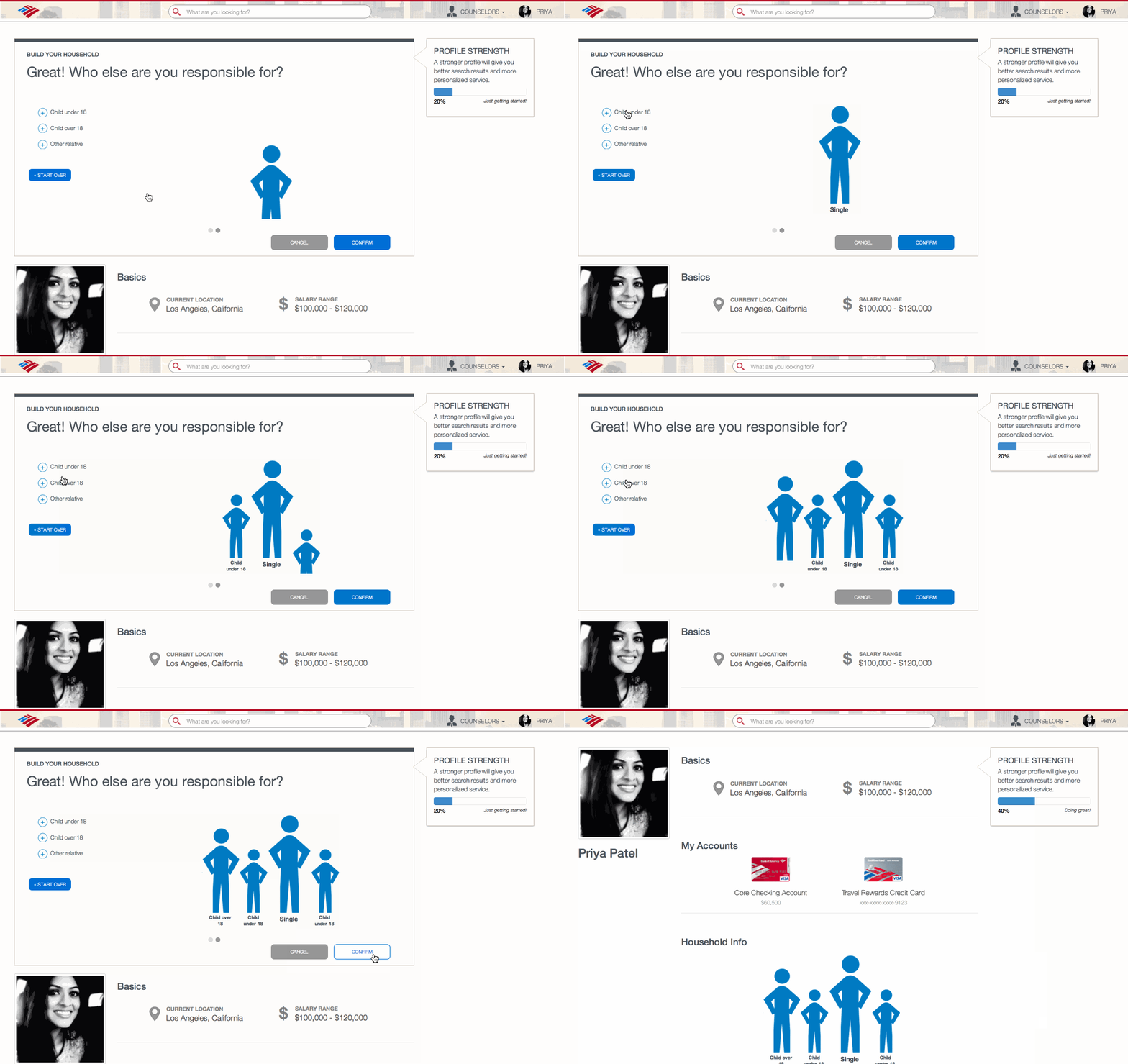
LINKING CUSTOMER PROFILES WITH HOUSEHOLD PROFILES
In order to provide a personalized online experience to rival the in-person branch experience, the website learns about you the same way a branch specialist would. This is done through learning about your household before making service suggestions and providing you product recommendations. Everything that is shown to you on the website will be related to information you provided the website.


